… through a review of the colour palette and imagery
In connection with the development of the company’s reporting and market communication, we updated Cell Impact’s visual identity to better match the company’s ambition to contribute to the green transition through unique technology.
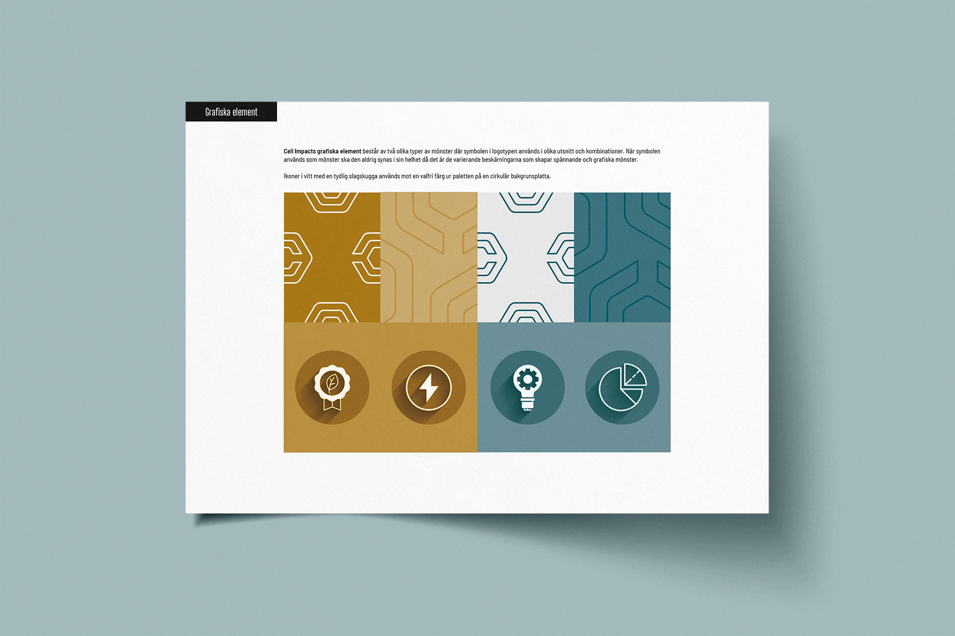
The foundation of Cell Impact’s colour scale now has a bright expression where the heavier colours in the palette create contrast and dynamics. The colour palette consists of a green-blue main colour, teal, which forms the basis together with a gold-brown ochre. These two are complemented with a darker tone of teal to add weight to the palette and a light grey colour that lightens up and brings a crisp, metallic feel.
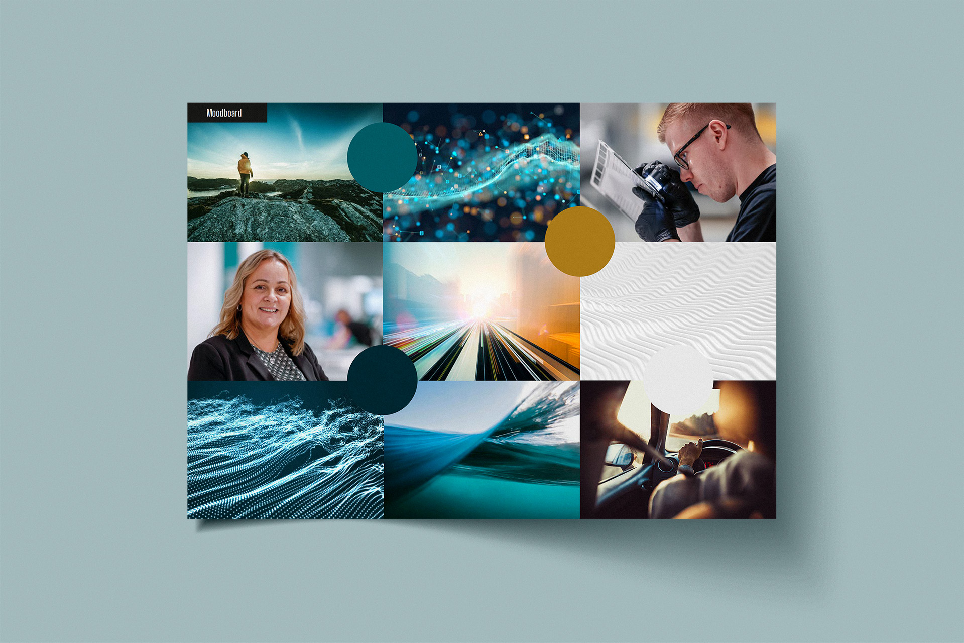
Cell Impact’s images should be permeated with energy and a drive forward, where the high-tech is visualised through images with an expression that evokes thoughts of electricity and gleaming metal. Close-ups of the flow plates in various sections should feel sharp and bright.
Result
The result is an expression characterised by high-tech sustainability – and with energy that drives forward.
Contact us to know more!


