
Studentlitteratur is Sweden’s leading publisher of educational materials, offering a broad range of educational materials, course literature and easy-to-read publications. The company’s communication guidelines had remained unchanged since 2013, despite significant growth and a fundamentally transformed communications landscape.
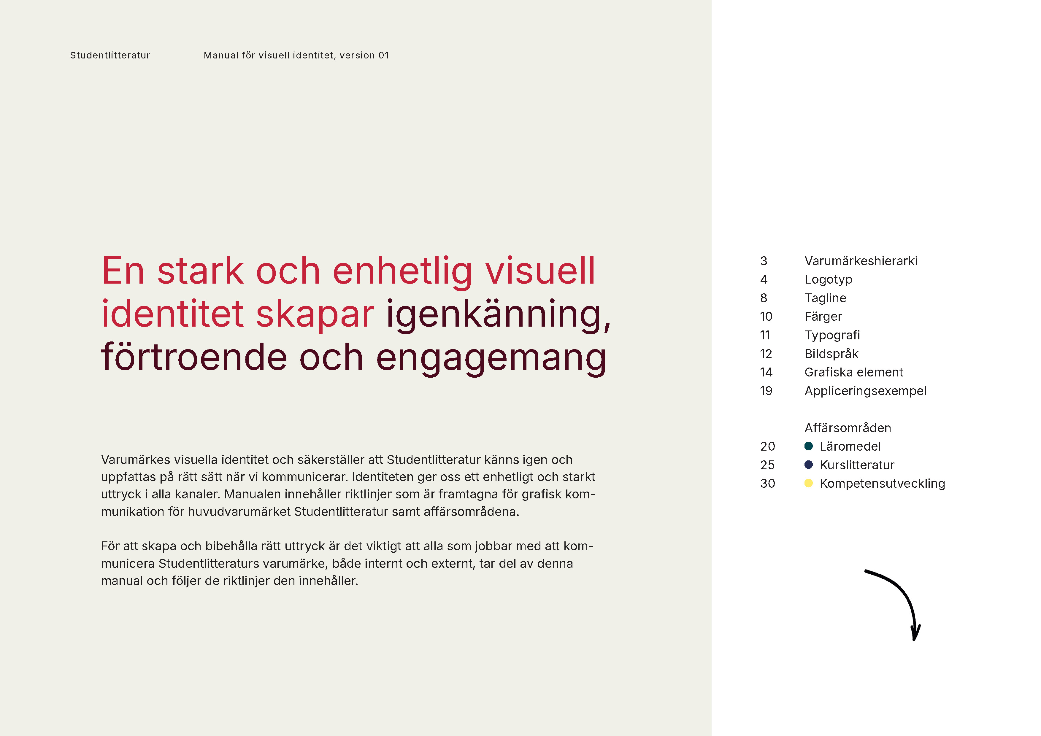
To meet new demands and create a more updated and cohesive visual communication, Studentlitteratur turned to Solberg. The objective was to renew the visual identity.
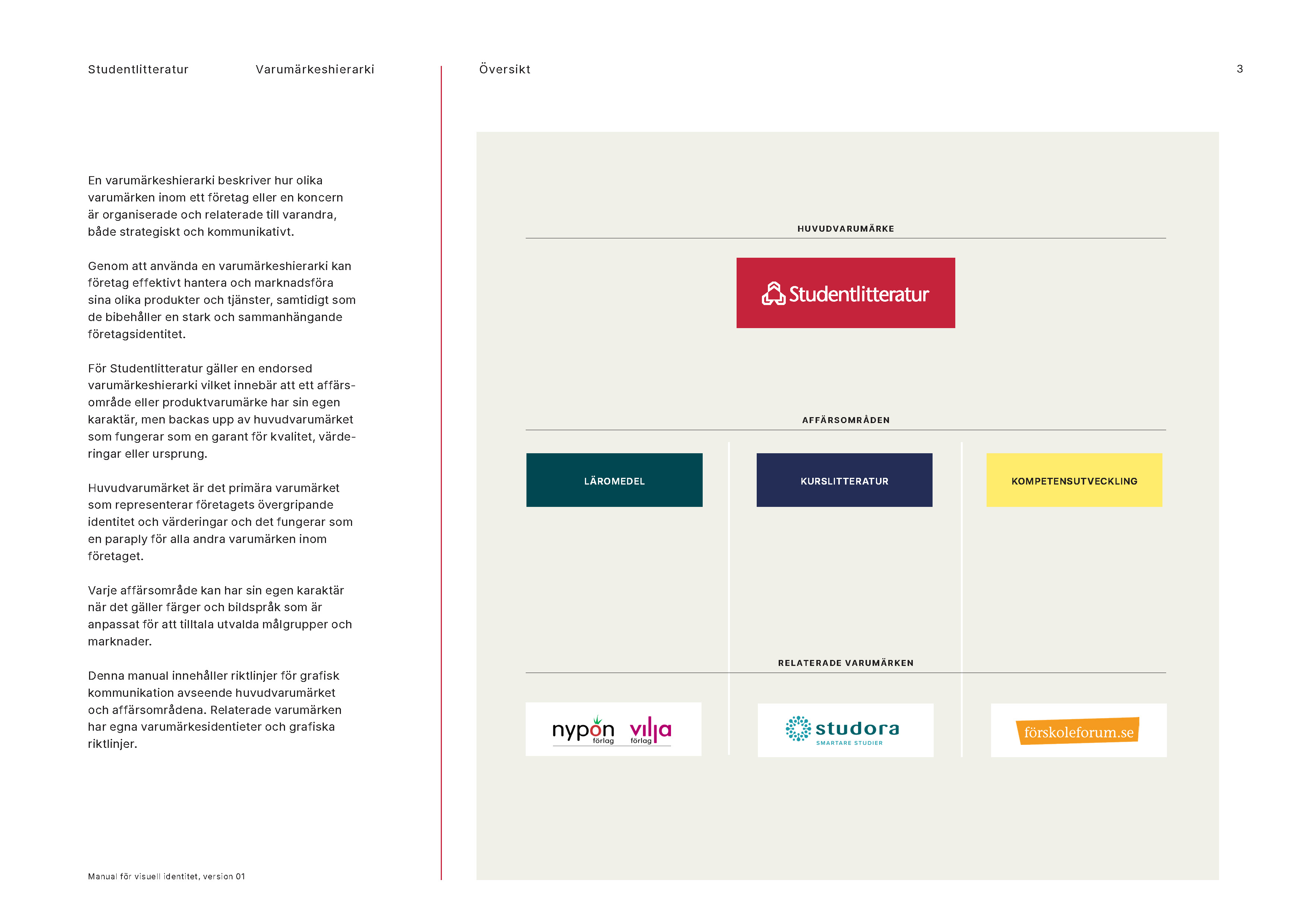
A particular challenge was the breadth of Studentlitteratur’s offering, which targets several – sometimes overlapping – audiences. The solution needed to clarify the core Studentlitteratur brand while creating alignment across communications, yet still allow expressions to be adapted for different target groups.
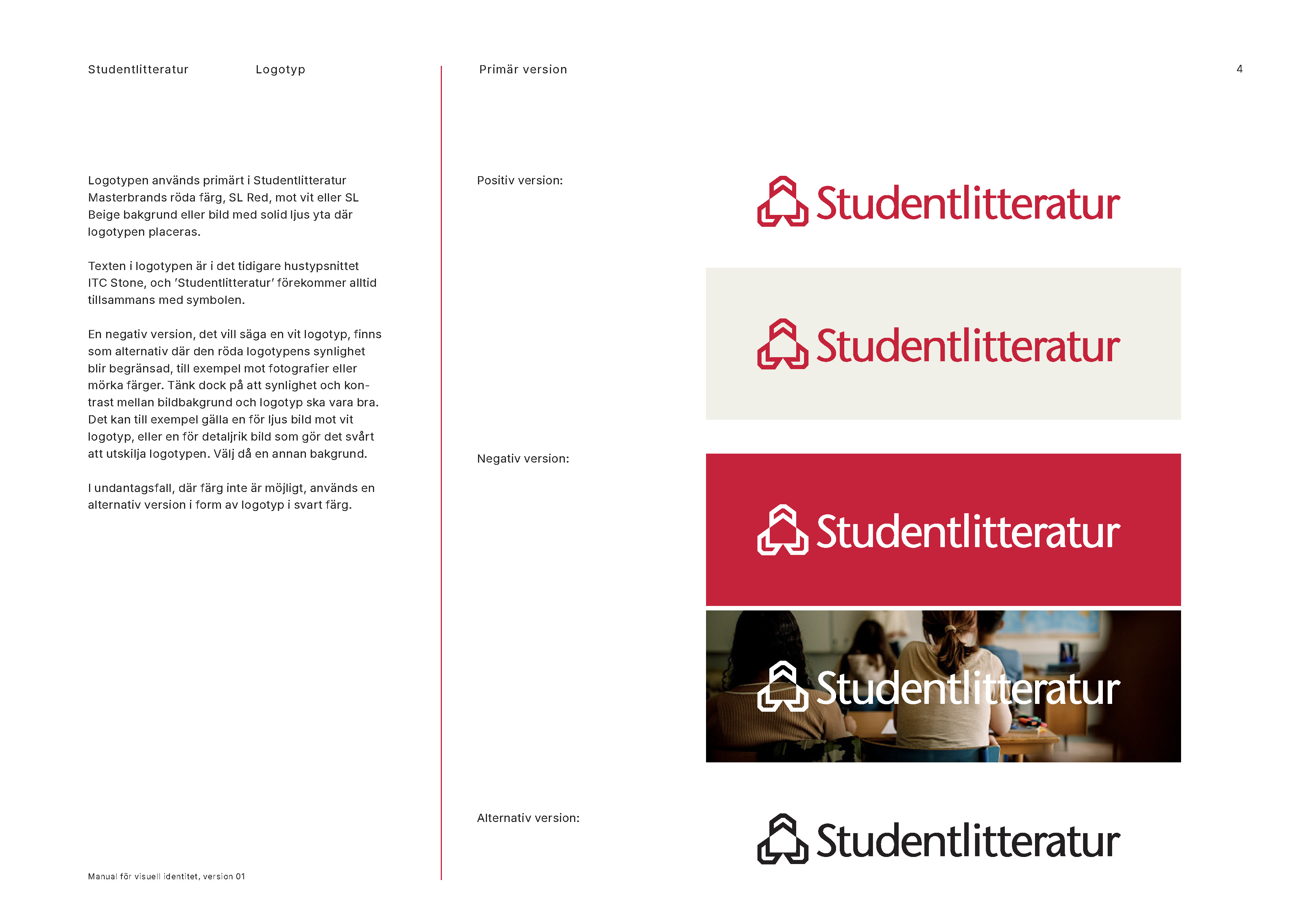
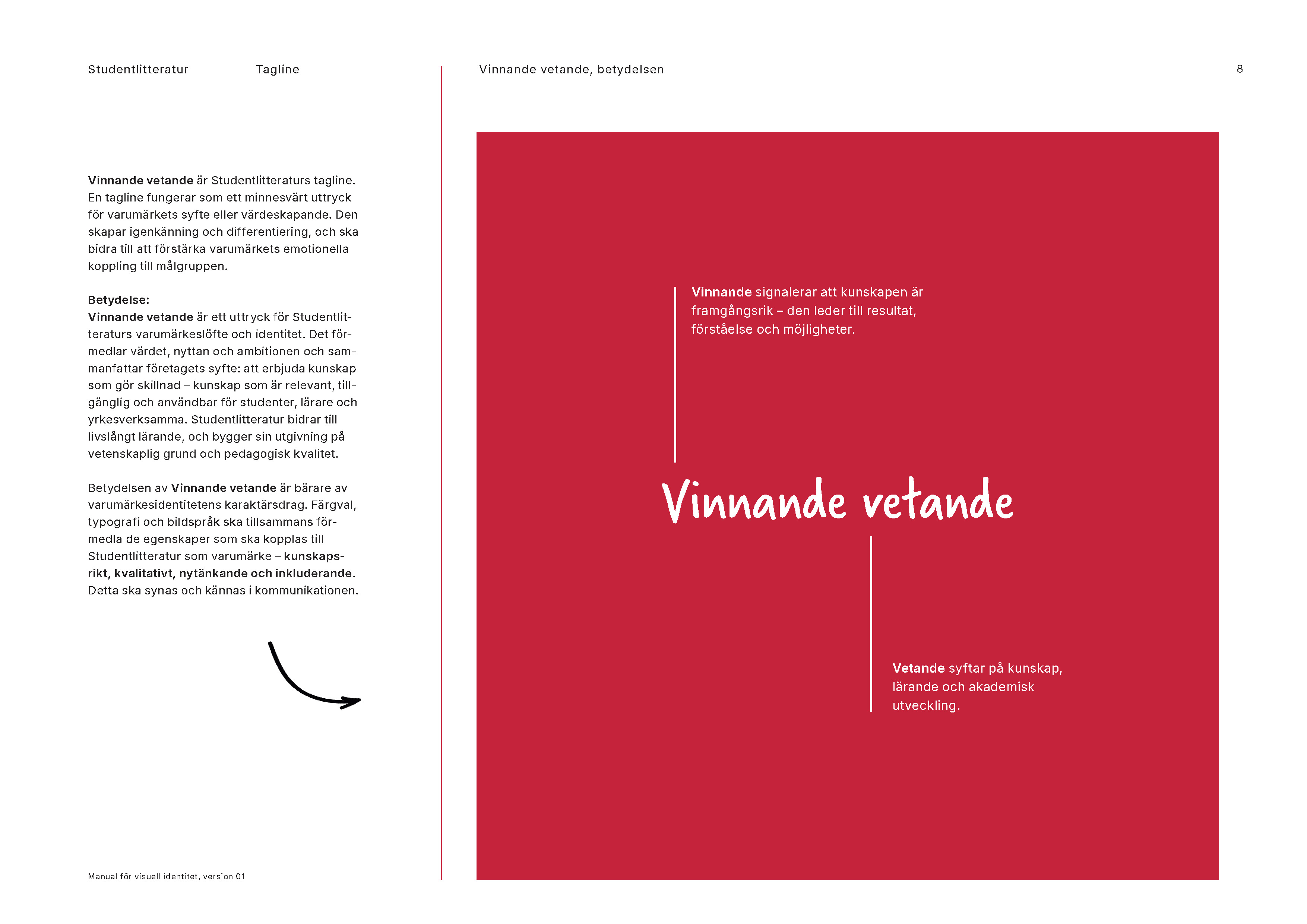
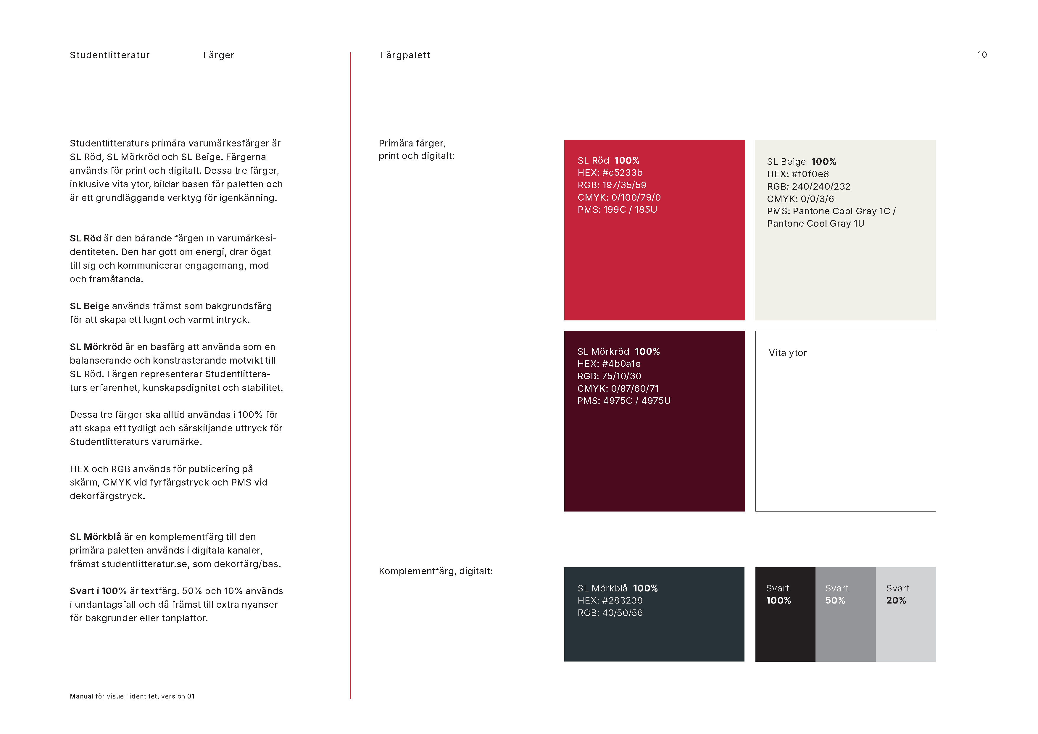
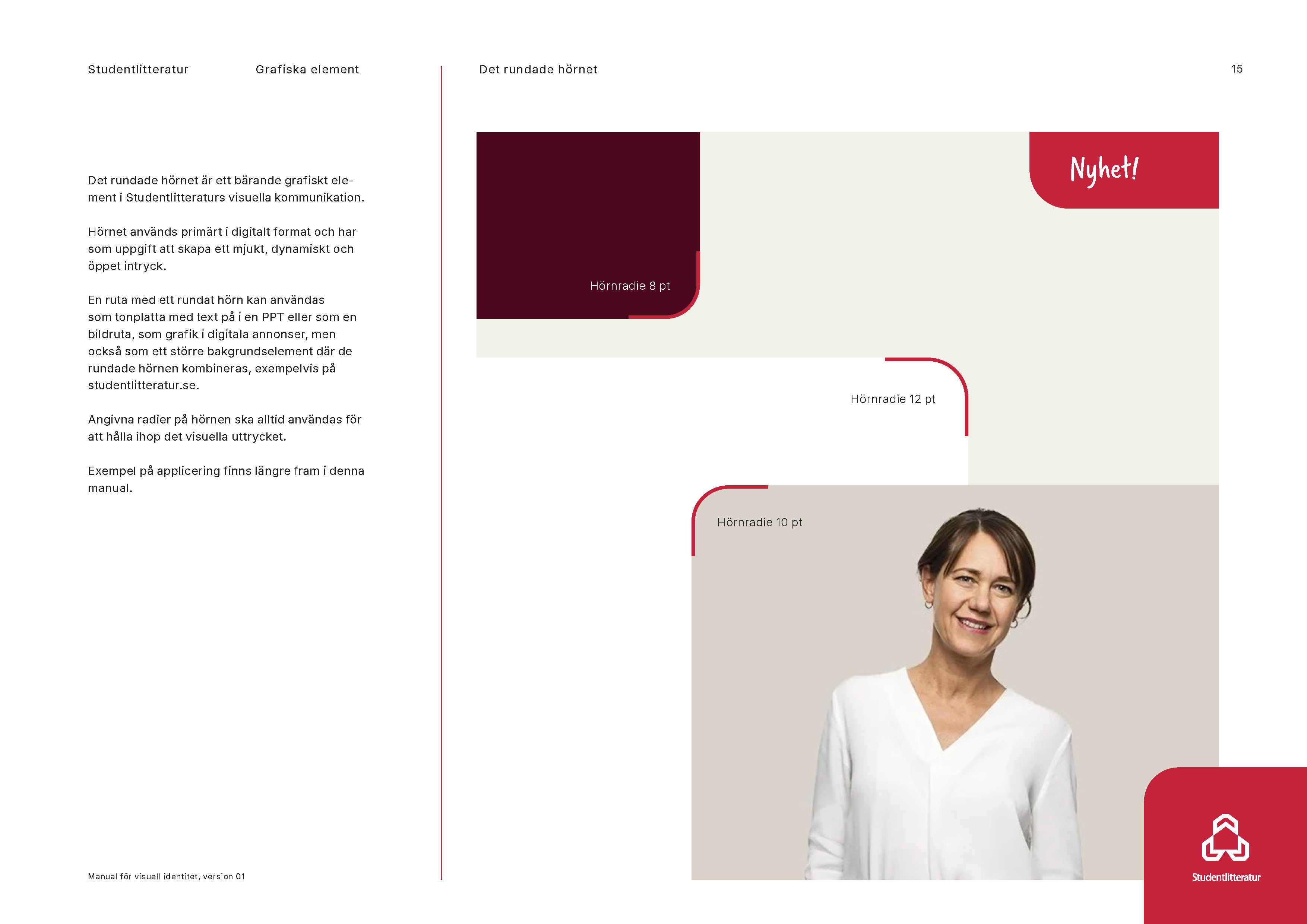
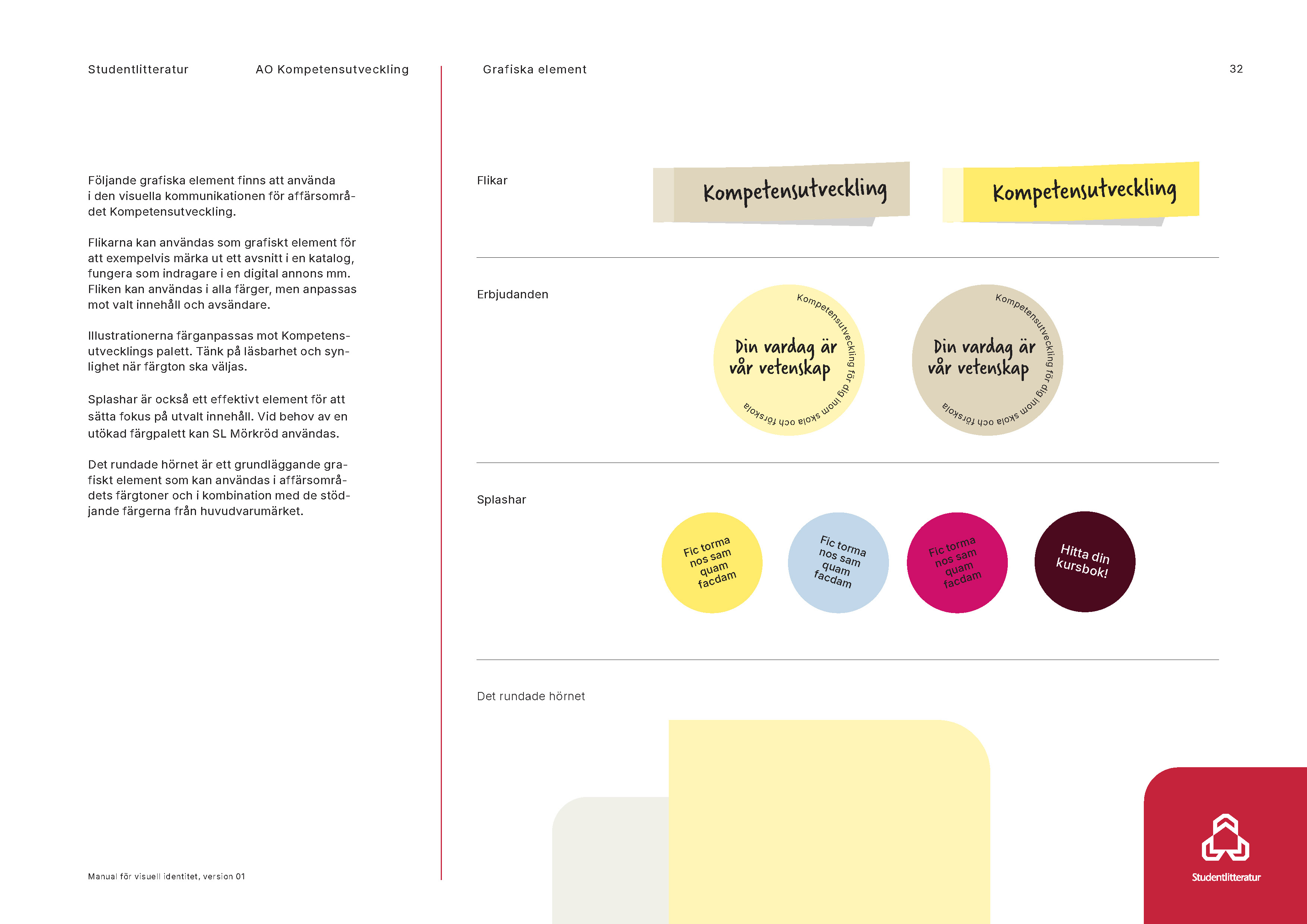
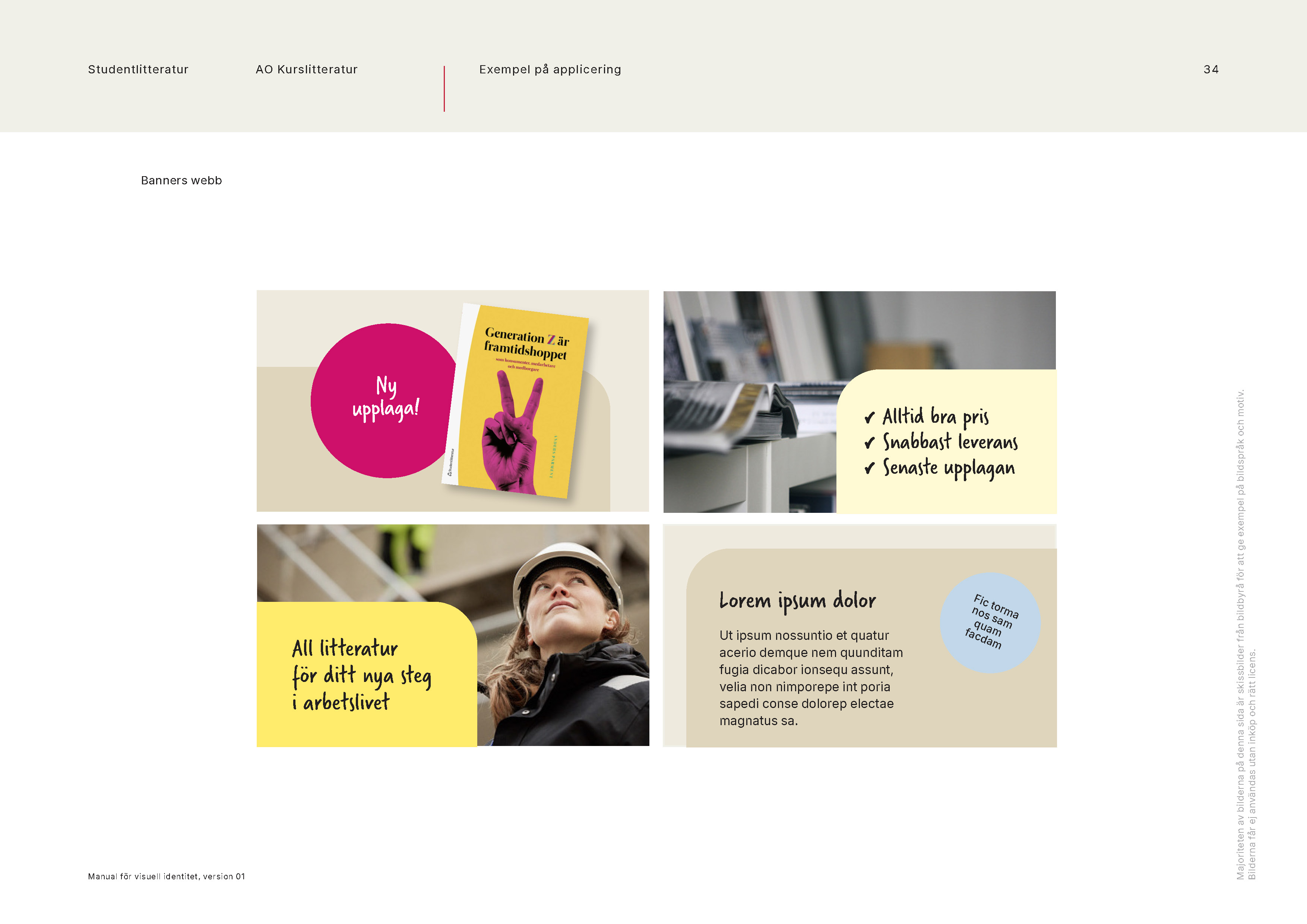
Solberg developed a brand manual including, among other things, an updated colour palette, a new photographic style and an icon concept, ensuring a modern, consistent and accessible visual identity – particularly optimised for digital channels.
With sensitivity and expertise, Solberg has helped us define our identity and see our brand from a new perspective. The result is a successful blend of tradition and innovation that we will carry forward in our future market communications.
Result
The outcome was a framework that strengthens the brand expression, simplifies internal processes and creates a consistent experience for Studentlitteratur’s audiences – regardless of channel, context or sender.
Contact us to know more!


